Since its beginnings at the turn of the 20th century, Miami (by which I mean the greater Miami area) has been a youthful city obsessed with design. Art deco was a huge influence in Miami and Miami Beach in the 1920s and 1930s, and South Florida still has the largest concentration of Art Deco buildings in the world. This ornate style was an outgrowth of English, French and Italian influences, and here it gradually combined with a fascination with the Moorish architecture of medieval Spain to create a style called Mediterranean Revival. That style was at the heart of George Merrick’s pioneering vision (with architect Addison Mizner and others) for Coral Gables, where The Biltmore Hotel, the site of our festival in its early years, is one of the grandest examples of this style.
Style – for better and for worse, from architecture to painting to fashion to a laidback Caribbean vibe, has been a dominant element in how South Florida perceives and projects itself. This is an area captivated by its history of glamour and glitz and a dynamic energy about modern art. Art is alive in South Florida, from the annual international Art Basel festival to the flourishing gallery scene, and that dynamism was part of our festival’s early days as well.
Since the beginnings in 1996 of what is now called VeritageMiami, art has had a role in our event. Wonderful art has captured the joy of wine and the role that wine has played in human life for more than 8,000 years. It also conveys the joy of this event amid these surroundings in particular. This week, I thought it would be good to share some of that art with you. I’ve included some of our covers in previous posts, so now let’s explore, not only the art, but the artists who created it.
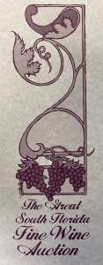 When the Great South Florida Fine Wine Auction started this celebration of wine, we weren’t sure where it would go and opted for a rather simple design that could double as a logo as well as the cover for our auction catalog. It’s a design that captures South Florida’s artistic bond with art deco by melding the graceful floral lines of the Italian precursor of art deco, called the Stile Floreale (floral style), with a fruit-laden grape vine – what could be more evocative than that? The following year the auction again used a basic design that was evocative of grapes in a night sky. The “real art” came with the creation of the festival proper with the one-night auction dinner at The Biltmore Hotel in April 1997.
“Bacchus” by Jesus Fuertes, 1997
For this first event, we turned to the Spanish artist Jesus Fuertes to create a painting to project an image of what we wanted to be as a festival. Fuertes was a protégé of Picasso and Dali in his youth then formed his own “neo-cubist” vision (he also called it “soft cubism”) as he moved from Spain to France to Brazil, always seeking studio space with plenty of sun and water. In the 1990s, he relocated his studio to Coconut Grove and opened a gallery on Eighth Street, better known to locals as Calle Ocho, the heart of Little Havana. Fuertes flourished in his own “blue period” (infinitely sunnier than that of Picasso) and even said he wanted to thenceforth be known as “the painter of the blue.”
“The blue” was prominent in his first painting for The Biltmore International Wine Festival in 1997. I like to think it reflected his happiness in his new home and he certainly embraced the theme in both title and subject, calling his painting “Bacchus.” This is a very modern Bacchus showcasing Fuertes’s “tropical neo-cubism” with a richness and elegance that suited The Biltmore venue that shimmers in the distance. I can quibble over Bacchus, who should know better, using a saucer glass instead of a proper wine glass, but why be picky with such an evocative painting?
1998 Festival Cover Art by Jesus Fuertes
The following year, we again turned to Jesus Fuertes for the festival artwork and got something entirely different. I love this piece, which is altogether more sun-drenched than Bacchus and carries with it a bit of Victorian propriety (and please do note that this year the couple in the painting are using proper wine glasses). This piece must have had a title, but it was never shared with us and the print that still hangs in our office only bears a number, 18/32. In my mind, it’s just “The Sunny Winos,” to be sure a title that is less grand than the event itself, but it works for me.
1999 Festival Cover Art by Jesus Fuertes
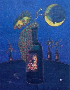
Fuertes’s art was so popular with our audience that we featured a third piece of his, again untitled, and unfortunately rather low resolution but my copy still shows Fuertes’s love of blue and his clever way of including elements like the moon over Miami, the grapes and recalling his 1997 image of Bacchus now envisioned as a wine label. Sadly, Jesus Fuertes passed away in 2006, though his daughter Astrid carries on his atelier via the internet at www.jesusfuertes.com where a giclée of the 1997 festival painting is still available for sale (at roughly the cost of a case of Château Lafite).
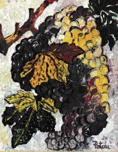
2000 Festival Cover Art by Patou
After three years featuring the art of Jesus Fuertes, in 2000 we welcomed the new millennium with a new painter and a dramatic shift in style. From the neo-cubism of the previous three years, we move to densely layered oils by the artist Patou. French and American by birth and raised in Monte Carlo, she traveled extensively as a young artist, absorbing influences in Asia and Africa as well as Europe before settling in Haiti in the late 1980s. It was there she says that she, “left all kinds of figures behind” and embraced abstract expression. She also discovered a talent for design and created lines of jewelry and furniture. Eventually she settled in Florida and we were one of the fortunate recipients of her artistic expression here. She brought the abstractionist’s eye to our vision, eschewing the people who populated our earlier covers and focusing solely on the grape. For the catalog in 2000, her painting is a multi-colored bunch of grapes with just a tiny bit of vine attached along with two leaves. The bunch though encompasses all of wine, carrying both red and white grapes in its pendulous beauty.
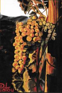
2001 Festival Cover Art by Patou
The following year, Patou again turned to the grape but in a much less rustic style. In the 2001 painting, a single bunch again contains both red and white grapes but it carries an almost da Vinci-like sense of sunlit shading against rolling Tuscan hills. Where the earlier painting was signed in ink the color of cabernet sauvignon, here she gives her signature a blast of red like pinot noir against firelight. Patou opened two galleries in 2006, one in Miami and one at DCOTA in Broward, and she also has a presence in Naples. Her work can be found on her website, www.patou.us
In 2002, another dynamic, multi-national artist joined our portfolio. Gilda Sacasas is a prolific and self-taught Cuban-American artist known for her work in several media, including painting and ceramics. I admire her precise and arresting sense of color and, to me at least, her playful geometry in how she places the figures in her artwork (she is very much a people painter). She has been an active promoter of the giclée technique, a process where she creates an original painting then digitally reproduces it with archival pigment inks. This is like a lithograph for the computer age, an artist-supervised process of creating a limited edition of high-quality art works (you can see many examples on her website, www.sacasas.com).
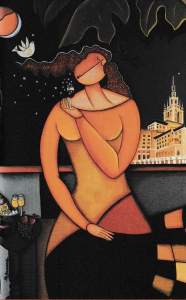
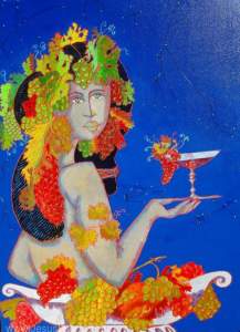
“La Dolce Vita” by Gilda Sacasas, 2002
Gilda has been exhibiting since 1989 and opened her own gallery in Coral Gables, in 1998. In her art, she focuses on several subjects including music and musicians, romance and café life. And of course, wine. She has been particularly active creating art for South Florida charities but I think her gorgeous poster for The Biltmore Great South Florida Wine Festival in 2002 is uniquely beautiful. A single taster is sitting somewhere on the upper level of the Biltmore’s Country Club Ballroom where our tastings were held, and you can see the hotel’s main building glimmering in the background. She has a glass of red wine in her hand (and two glasses of white off to the side, perhaps for a vinous assignation after the bidding is finished) and she is sampling the bouquet as a cloud of stars wafts from the glass. Ahem, waiter, I’ll have what she’s drinking.
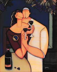
“La Vie” by Gilda Sacasas, 2003
The following year, our taster is back, this time with her paramour, and they each have a glass from a bottle of “The Biltmore 2003” on the table in front of them. Apparently, they are in a pergola, a growing area with overhead trellising as there are bunches of grapes hanging above them. I always thought this painting summed up The Biltmore Great South Florida Wine Festival – wine lovers having a transcendent experience of sharing and generosity. I loved the way Sacasas plugged right into the spirit of the event, and we were honored by her generosity in creating a painting that was not only featured on the festival catalogs that year but that was also donated to our auction to help raise funds.
This year, 2003, was our final year at The Biltmore (I will explain the transition next week, so watch this space). In 2004, the festival moved to a larger space at the InterContinental Miami (where, with only a couple of exceptions, we have continued to hold the event to this day) and with the move came a more commercial vision for our artistic representation. While we were at The Biltmore, the hotel exerted a powerful influence on the design of the auction catalog, wanting a publication (albeit an expensive one) that promoted the property’s luxury image. With the move in 2004, we seized an opportunity to create a less artistic but more brand-centric vision for the publications. We wanted a look and feel that could extend to all sorts of material, from press kits to staff badges as well as giving a more modern sense of vibrancy to the auction catalogs and tasting guides.
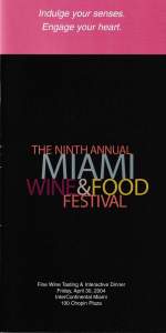
2004 Festival Tasting Cover
In 2004, that look and feel capitalized on the modern vision of Miami-deco (think the bright colors of Miami Vice meeting a clean, modern aesthetic). Flamingo pink had to play a role, but so did a multi-color palette to reflect the multi-flavor palate of the wines on display. And thus a new look – it was pink and black punctuated by the colors of Provence rosé, grand cru Burgundy, Napa chardonnay and Miami twilight. It was the new look of the newly christened Miami Wine & Food Festival and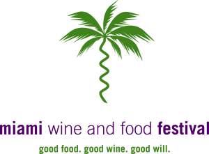 ushered in a trend of having logos and branding rather than artwork. The following year in 2005, we introduced the hybrid corkscrew and palm tree that symbolized our event for a decade. It’s one of my favorite bits of imagery around this great event and one I treasure. I just can’t use it to open a wine bottle.